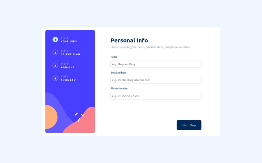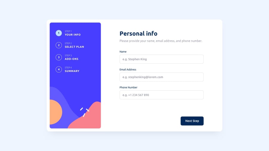
Design comparison
Solution retrospective
This was very challenging and I had to restructure the layout multiple times to make sure things shifted according to screen size. Mainly the footer with the navigation buttons started as just regular buttons, but only after realizing that they would move out of the main form container on smaller screens did I realize, I need to make it a footer. My advice would be to use a footer for the navigation buttons. This took me a month to complete (maybe more unfortunately) but it was well worth it seeing what I have completed. So much logic 😩
Community feedback
- @NatureSon22Posted about 1 year ago
Wow, your hard work really shines through; this looks great! I'm new to React myself and am currently navigating this exact project. I took a peek at your code and noticed you've placed everything in App.js. Breaking it down into separate components might make it more organized. Additionally, integrating React Router DOM and the Context API could enhance this project further. Regardless, kudos on your efforts; I'm confident this project will be a valuable learning experience for both of us!
Marked as helpful0
Please log in to post a comment
Log in with GitHubJoin our Discord community
Join thousands of Frontend Mentor community members taking the challenges, sharing resources, helping each other, and chatting about all things front-end!
Join our Discord
