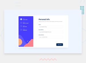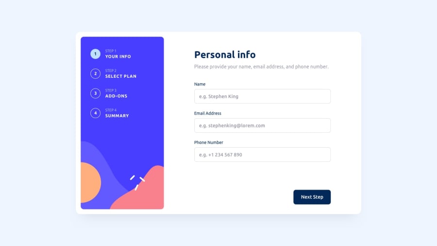
Design comparison
Solution retrospective
This solution was built with React. The sections of the form are generated dynamically using a json format, meaning that more sections can be added very easily.
I would appreciate any feedback! Thank you.
Community feedback
- @bsarniiPosted almost 2 years ago
I like to compare my solutions to others. Your solution is the nearest to the original design. The UI on desktop and on mobile and the functionality of the app is really good. Very nice job!
1@cvenenciaPosted almost 2 years ago@bsarnii thank you so much! At the start my main focus was to get the functionality done following good practices, and I think I mostly did. Right at the end, I decided to try and follow the design as close as posible. I started to measure everything using Windows PowerToys, which helped a lot to do so.
I appreciate your comment!
0
Please log in to post a comment
Log in with GitHubJoin our Discord community
Join thousands of Frontend Mentor community members taking the challenges, sharing resources, helping each other, and chatting about all things front-end!
Join our Discord
