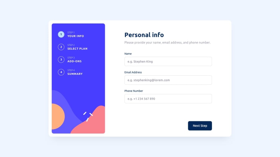
Design comparison
Solution retrospective
I found this project to be deceptively complex despite looking like a simple form. I've made forms before but this is my first time making a multistep form on a single page.
Entire form is client side so no back-end though you could certainly have built it with a databse.
Design file only included a desktop and mobile so I focused on that, tablet is still currently a work in proress so design may be a bit buggy but functionality is still there.
This form includes:
- Form Validation and also a summary at the end before hitting the 'confirm' button.
- 'Back' and 'Next Step' buttons
- Nav bar on the side (or top for mobile) to navigate between steps
- Ability to change plan from summary stage
Everything should work as intended.
First time using React Router too so if there are any suggestions or feedback, feel free to comment!
Thanks :)
Community feedback
Please log in to post a comment
Log in with GitHubJoin our Discord community
Join thousands of Frontend Mentor community members taking the challenges, sharing resources, helping each other, and chatting about all things front-end!
Join our Discord
