Design comparison
Solution retrospective
built using redux
Community feedback
- @elvissamuelPosted over 1 year ago
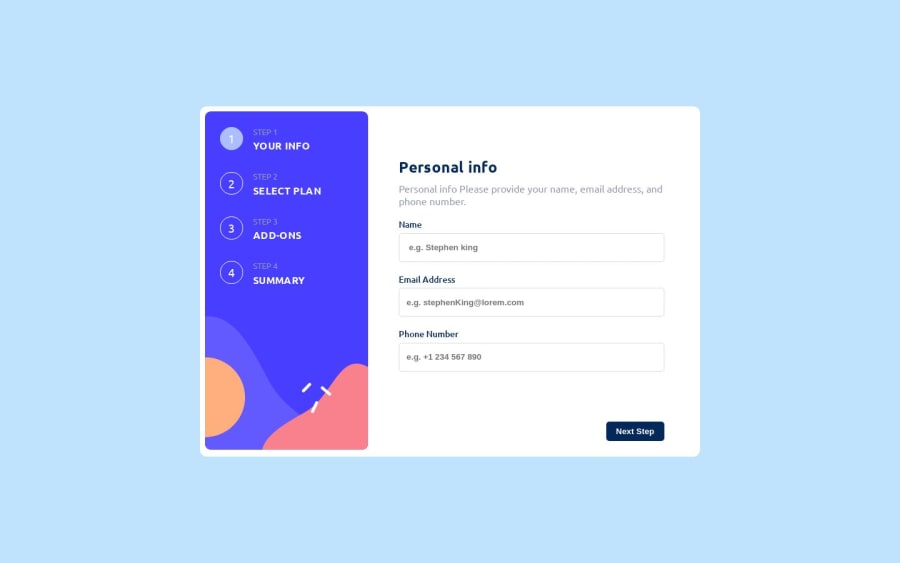
Your form is not centered on the webpage, I dont know if its just my screen, but you can check again from your end. Overall, your design looks really neat and impressive.
1@jamesekunolaPosted over 1 year ago@elvissamuel, Thanks for your feedback. I have reviewed it on my screen, and it appears to be satisfactory. Could you please take another look to ensure that the recent changes I made have addressed the issues? If there are any further adjustments needed, please let me know. I greatly value your feedback, and I appreciate your assistance once again.
0 - @jamesekunolaPosted over 1 year ago
Added a country select for the phone input, all that is left out is refactoring the code. Thanks y'all for feedback, I had to test the app on all browsers to see how it look. I found out that the checkbox box display different on opera mini browser.
0
Please log in to post a comment
Log in with GitHubJoin our Discord community
Join thousands of Frontend Mentor community members taking the challenges, sharing resources, helping each other, and chatting about all things front-end!
Join our Discord
