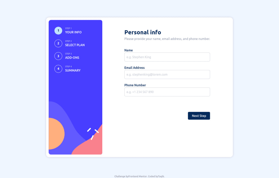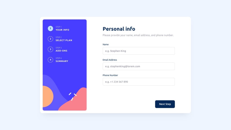
Design comparison
Solution retrospective
This is my first JavaScript heavy project I had a lot of problems while building especially with the form and switching sections it was also really hard to get it to display properly for various screen sizes but I did my best.
Community feedback
- @Binh2Posted almost 2 years ago
Hey there! 👋 Here are some suggestions to help improve your code:
Congrats on completing your challenge! 🙌
I have 10 suggestions for you:
- Add checked attribute
<div class="plan arcade" />to always check one even if the user haven't check anything. - Since this is a form page. I think you should wrap your page in <form> tag instead of <main> and <section> tags.
- You should use
<input type="tel" />instead of<input type="number" />for telephone. Because telephone can sometimes be written as "0123-456-789" (invalid number, btw) or (415) 555-2671 (can't type parenthesis in type="number") - You should use
input[type="text"], input[type="tel"] { cursor: text; }instead of cursor: pointer. - Use <img> tag with alt attribute instead of using CSS background-image when the image relate to the content. This have the added benefit of improve your SEO, improve accessibility and people who print your webpage will see your image.
- Clicking on "Monthly" and "Yearly" text in "Select plan" doesn't do anything. You could do .option { cursor: default; } to show that it's not clickable or add JS events to those.
- Your "Go back" and "Next step" buttons doesn't stay in 1 place each time I navigate
- The finish up page only being display statically. You should make the finish up page dynamically updates based on the choices that were made in previous step.
- Pick add-ons only work correctly when I clicked on text. Should also work when I click on container. I think part of the problem is you only set data-checked property to true. You should prevent the default event of checkbox and set the checked attribute in JS manually.
- Bonus: When the user click on your 1 or 2 or 3 or 4 "sidebar", your page will navigate to "Your info", "Select plan", "Add-ons" and "Summary" page respectively.
If you have any questions or need further clarification, feel free to reach out to me.
Happy Coding! <3 😊
Marked as helpful1@taqhPosted almost 2 years ago@Binh2 Hello thanks for your suggestions I will take them into account for correction
I did notice the checkbox issue and I needed a tip on how to do it thanks
For the final page I did state that I’m new to Js so I do not have a good idea on how to display the summary based on user choice hence why it’s hardcoded and only changes between monthly or yearly I would appreciate and tips on how to go about it
Also the sidebar tabs are that way because I tried to do exactly what the design shows and it didn’t have any functionality except the active state (blue background).
0@Binh2Posted almost 2 years ago@Dom-iha
- I just gone to your website again. And the checkbox issue disappear. I guess you know how to do it now
- To display the summary page. The easy way is to have an array of true/false like this [true, false, true]. Anything that is false will be
.add-on-sum { display: none; }. I guess you just fix it right now ... :v - The sidebar is just something I think would be logical only. You don't have do it
Happy coding <3 :))
1@taqhPosted almost 2 years ago@Binh2 Thanks for following up yes I looked up a way to do display the summary. It was rather stressful but it worked so I'm trying to display the total now
0 - Add checked attribute
Please log in to post a comment
Log in with GitHubJoin our Discord community
Join thousands of Frontend Mentor community members taking the challenges, sharing resources, helping each other, and chatting about all things front-end!
Join our Discord
