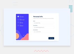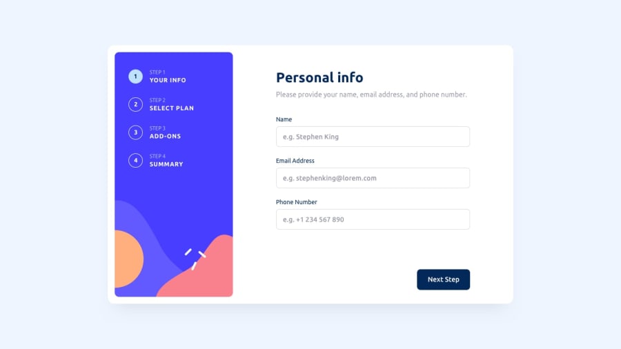
Design comparison
SolutionDesign
Solution retrospective
Please, I need help with my JavaScript codes, and how I can improve my codes more efficiently and professionally. Does anyone have materials I can use to improve my React, I could have used React, but I'm still a learner at it, thank you.
Community feedback
- @Nnadivictory25Posted almost 2 years ago
Just checked your solution, here are my observations I think might be helpful
- The input should not have a cursor:pointer on them
- Your error messages should be individualized
- Your error message should also disappear after sometime
- You are not validating the inputs well enough , don't just check if they're empty. Also check if the user put the correct email format, didn't put a number as name and also the email shouldn't start with a dot too
- The steps container on the left should be fixed , it is always trying to adapt to the layout therefore resizing itself often
- Your 'subs' should have a better padding-y i.e: top and bottom , the height should be higher
- User shouldn't be able to proceed to step3 if they didn't select a plan too
Marked as helpful1@IcyEazyPosted almost 2 years ago@Nnadivictory25 Thank you for the observations.
0
Please log in to post a comment
Log in with GitHubJoin our Discord community
Join thousands of Frontend Mentor community members taking the challenges, sharing resources, helping each other, and chatting about all things front-end!
Join our Discord
