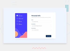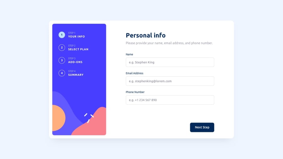
Design comparison
Solution retrospective
This challenge was a good one. The form validation logic was fun to figure out. I would recommend you do it if you want to improve your Form building and validation skills. Please feel free to leave me any comments that would help me improve my coding skills.
Community feedback
- @WandolePosted almost 2 years ago
Hey,
This challenge is not easy but you've made a good job!
To improve it, maybe you could put a max-width on the .container: on large screen, the design become wierd!
The validation on the 1st form good too! You could try to use Regular Expression to make the validation easier/better (it's enought already but RegEx can really improve it!). It's not that complicated if you use tools to help you (for ex: https://regexr.com/ where you can test your RegEx and find RegEx ready to use/adapt)
Have a good day :-)
Marked as helpful0@ahmedd-osamaPosted almost 2 years ago@Wandole Thanks for the review! I will surely the max-width improvement. I already know about RegEx but it did not come to my mind to use it in this demo form. I will consider adding it to the validation too. Appreciate your help a lot :-)
0
Please log in to post a comment
Log in with GitHubJoin our Discord community
Join thousands of Frontend Mentor community members taking the challenges, sharing resources, helping each other, and chatting about all things front-end!
Join our Discord
