Submitted almost 3 years agoA solution to the Multi-step form challenge
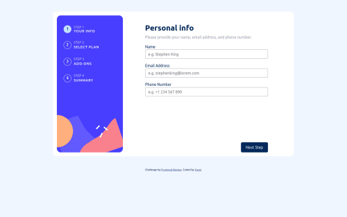
MultiStep form - with Bootstrap
bootstrap
@yanyan-alien

Solution retrospective
Any feedback is welcome!
I've yet to align the container to the middle of the screen. Other than that, is there any problems with my code?
Also, for the toggle switch, do people actually build them from scratch in real world development or do people use a library for that?
Code
Loading...
Please log in to post a comment
Log in with GitHubCommunity feedback
No feedback yet. Be the first to give feedback on yanyan_alien's solution.
Join our Discord community
Join thousands of Frontend Mentor community members taking the challenges, sharing resources, helping each other, and chatting about all things front-end!
Join our Discord