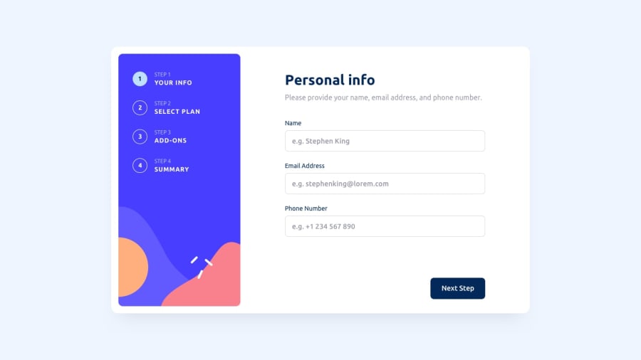
Design comparison
Solution retrospective
Hi everyone, I really liked this project it was quite a challenge. I wanted to try to get the form data to local storage, but it was taking already too long. Also, my form validation is not great. If you have any recommendations pls let me know
Community feedback
- @antran1245Posted almost 2 years ago
Looks good. I would say that you can make the listing on the left side be clickable so that people can skip a step(if this is not their first time so they know the content) or go back to a certain step.
Instead of saying This field is invalid for the phone number validation, you can put number only. Because your placeholder have a + so someone might think that they can put a + too. Also it be clearer on what is allow.
Marked as helpful0
Please log in to post a comment
Log in with GitHubJoin our Discord community
Join thousands of Frontend Mentor community members taking the challenges, sharing resources, helping each other, and chatting about all things front-end!
Join our Discord
