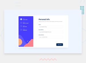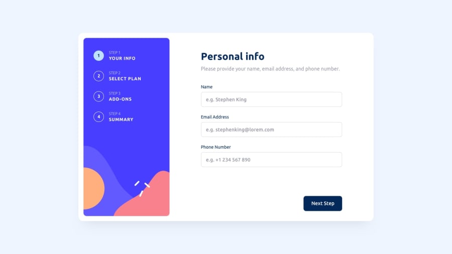
Design comparison
Solution retrospective
- What did you find difficult while building the project? Frontend Mentor Provides 2 Svgs in Starter files. I'm facing problem with Mobile background and Desktop background. how can we use both backgrounds to make it responsive and load according to the screen size. I tried but facing many challenges. Which areas of your code are you unsure of? How should I use those backgrounds should I use css and media quaries to show at a particualr screen size or use srcset for perticular screen size. How can we make smooth transition from mobile svg to deskop (vice versa)
Community feedback
- @Emmanuel-GumedePosted almost 2 years ago
Hi Manishgtx, Your desktop design works as intended except that your first page loads with input errors displayed even before the user interacts with the form. The errors should only show when the user clicks on 'Next Step' button without filling in the form. You have not implemented a mobile design for the solution even though you have included some media queries in your CSS. Responsive design is paramount in today's web development. With regards to your question about the background image for desktop and mobile, you need to use a media query in your CSS file for desktop devices (assuming 'mobile first' design approach) and change your background image url to point to the correct image.
1
Please log in to post a comment
Log in with GitHubJoin our Discord community
Join thousands of Frontend Mentor community members taking the challenges, sharing resources, helping each other, and chatting about all things front-end!
Join our Discord
