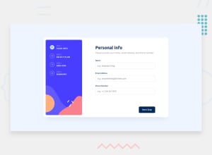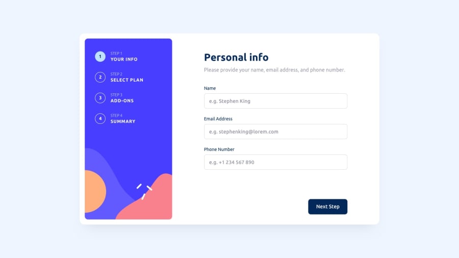
Design comparison
Community feedback
- @IllusiveCoder1101Posted almost 2 years ago
Firstly congrats on completing the challenge , it wasn't an easy one. I noticed a few problems with your site:- 1.The step numbers present on the nav-bar/side-bar aren't meant to be buttons , their only purpose is to show the Active step. If treated as buttons , there would be no point of the next and the back buttons. 2. The site appears broken on my desktop, each of the sections are overflowing, so try testing it on all the screen provided on the console. 3.It's not dynamic , the site is clearly static, even when I choose a different plan , it's not updated on the confirmation page. 4.For the Accessibility error, try replacing the <h4/> tags with <h1/> tag. (Also there's a typo on the first page , you wrote "Pleas" ) That's mostly all :)
0
Please log in to post a comment
Log in with GitHubJoin our Discord community
Join thousands of Frontend Mentor community members taking the challenges, sharing resources, helping each other, and chatting about all things front-end!
Join our Discord
