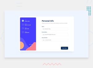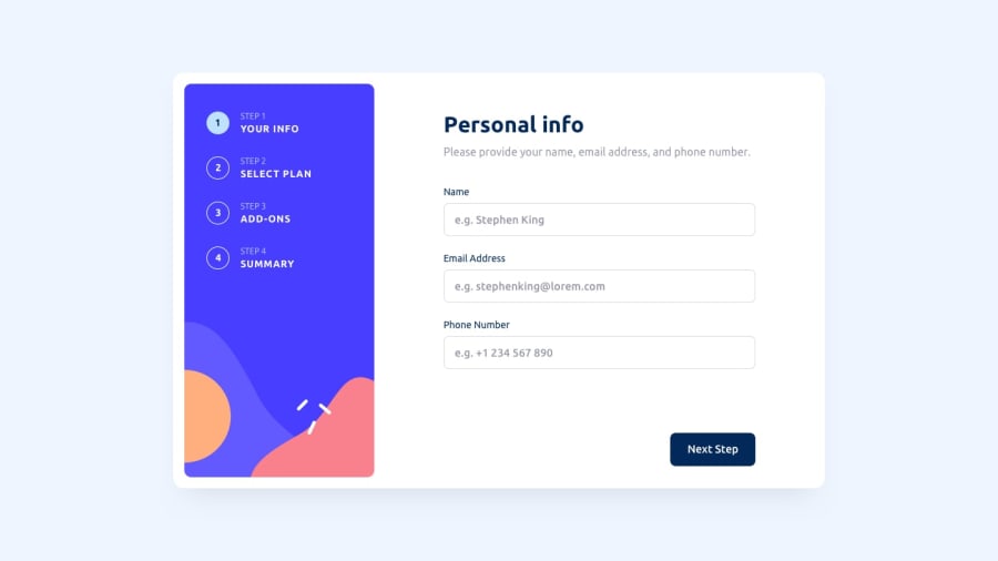
Design comparison
SolutionDesign
Community feedback
- @khubaibulPosted almost 2 years ago
Hi! I have checked your project. You have done it well. Try to improve some components like buttons, input field and selectable plan.
First of all, try to align all buttons to be fixed at the bottom. Now your some button is under the div. Like Next Step, Back, Next etc. Secondly, use the input type "email" for an email input field.
Then give some CSS effects based on the selected card. So that user can understand which card he selected.
Also, your yearly plan isn't working somehow.
Best of luck. Have a good day.
0
Please log in to post a comment
Log in with GitHubJoin our Discord community
Join thousands of Frontend Mentor community members taking the challenges, sharing resources, helping each other, and chatting about all things front-end!
Join our Discord
