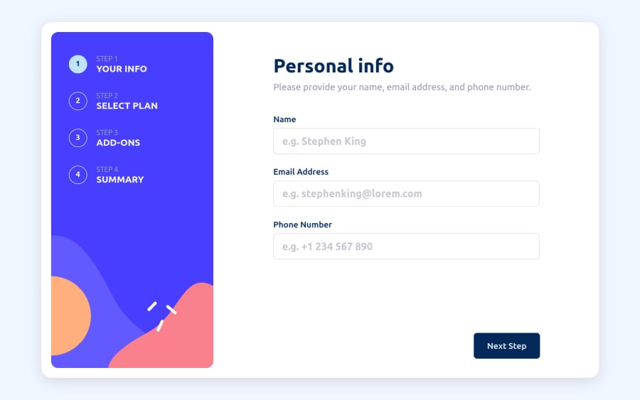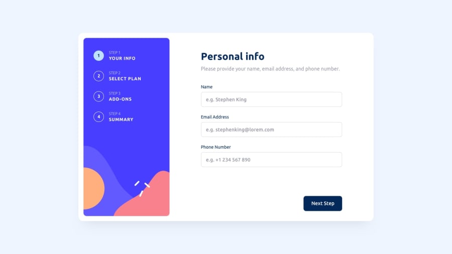
Design comparison
Solution retrospective
This was my most complex App so far. I'd be really grateful if someone could help me answer these questions:
- Does anyone have some recommendations on how I should've structured my folders/files/componets?
- I've used CSS modules to style my components and it was a bit messy at first. So my question is, do MaterialUI and TailwindCSS have different purposes? And which would you recommend I should go for in further projects using React?
Any feedback is welcome! And thanks in advance!
Community feedback
- @SwiichyCodePosted almost 2 years ago
Hi!
The design corresponds well to the requested features and they are also present on the summary section with the toggle. I had a doubt about this feature of returning to a lower index or directly changing the state of the monthly, but I think it is the most logical.
In terms of accessibility, I don't understand why the tabulation was placed on the pagination? You could potentially manage the tabulation of the different cards in "Select Plan" and the checkboxes in "Pick Addons", and why not add keyboard selection for better accessibility."
1@EduardIonescuPosted almost 2 years ago@SwiichyCode Hi,
I had my doubts about the
Changebutton as well, but this seemed logical.I'll try to implement the cards/checkboxes tabulation tomorrow, do you have know any good resources for it ? I haven't done it before.
Thanks for the help!
0
Please log in to post a comment
Log in with GitHubJoin our Discord community
Join thousands of Frontend Mentor community members taking the challenges, sharing resources, helping each other, and chatting about all things front-end!
Join our Discord
