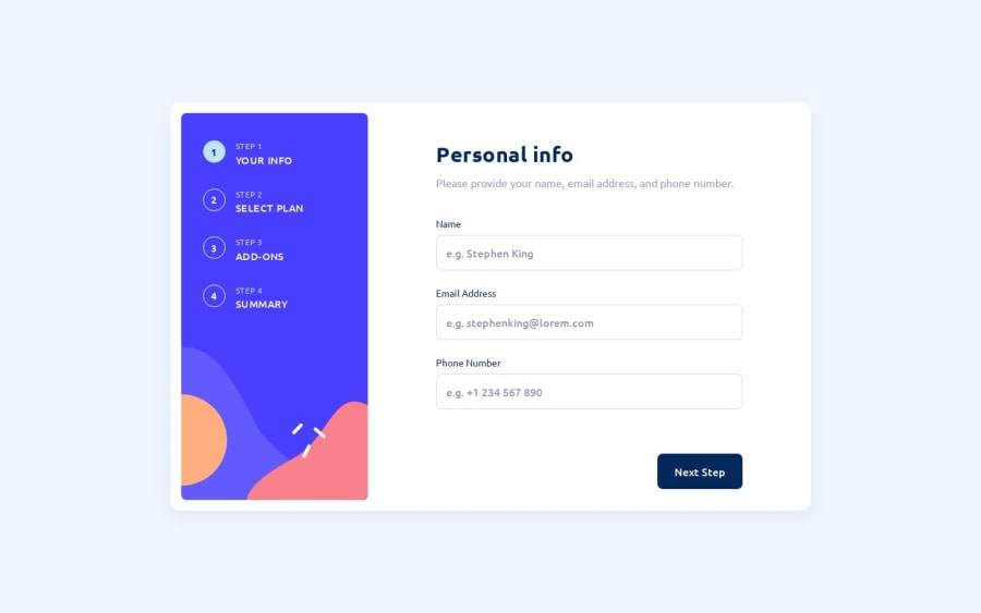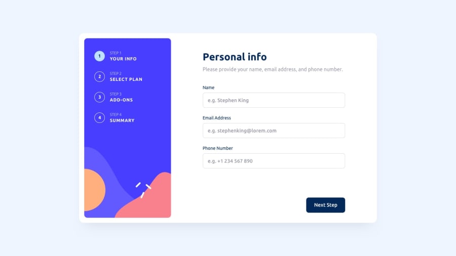
Design comparison
Solution retrospective
Please, let me know your thoughts about my HTML structure and CSS. I didn't do validation with JS and price calculation.
Please log in to post a comment
Log in with GitHubCommunity feedback
- @lirapanci
Hello,
Nice work.
I'd suggest some minor changes in order to make the project perfect. Since this is a form, every input of it should be filled in order to proceed to the next step; The buttons on the steps on the left should be able to click, for instance, if you're in the second step, you can click step 1 and go back to it; The last thing is that when you click the toggle button and go to a Yearly membership, all the prices as well as the acronyms for monthly (mo) should change to Yearly (yr).
Cheers, Lira
Join our Discord community
Join thousands of Frontend Mentor community members taking the challenges, sharing resources, helping each other, and chatting about all things front-end!
Join our Discord
