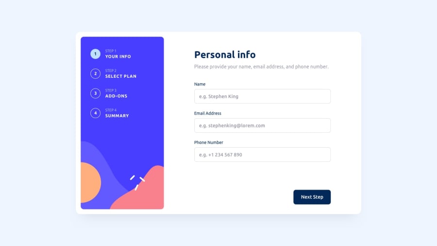
Design comparison
Solution retrospective
This is my solution for the Multistep form. I have used React to create it. To manage the state and the error handling and validation I have used the context and React Hook Form. This is also the first project I have used Typescript to manage the component props and form types. Working with the React Hook Form and using Typescript the first time was the toughest part for me. The styling was made with a mix of Styled Components and TailwindCSS. The form also submits you data to an API but does not save it there. Do not worry. Its just an API to simulate the POST request.
Community feedback
- @sambuka-aPosted about 1 year ago
Nice and clear solution, congrats A tiny suggestions if you don't mind:
- don't think cursor pointer is needed on form fields hover;
- phone number mask is a bit misleading because it wont pass validation;
- same title and description for all 4 steps;
Marked as helpful1@alexander-hergertPosted about 1 year ago@sambuka-a Thank you for pointing this out. During the refactoring I missed that part it seems. I also changed the regex a bit for the phone numbers so that the eg. fits. I made the decision to keep the pointers since I also see that in the active design state. Best regards Alex.
1
Please log in to post a comment
Log in with GitHubJoin our Discord community
Join thousands of Frontend Mentor community members taking the challenges, sharing resources, helping each other, and chatting about all things front-end!
Join our Discord
