Submitted almost 3 years agoA solution to the Multi-step form challenge
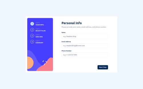
Multi-step form solution
react, sass/scss, vite, accessibility
@OneManBanned

Solution retrospective
I'm hoping to use this project as a portfolio piece. If you notice any issues with responsiveness, accessibility or any other problems please let me know.
Thanks, Brendan.
Code
Loading...
Please log in to post a comment
Log in with GitHubCommunity feedback
No feedback yet. Be the first to give feedback on Brendan's solution.
Join our Discord community
Join thousands of Frontend Mentor community members taking the challenges, sharing resources, helping each other, and chatting about all things front-end!
Join our Discord