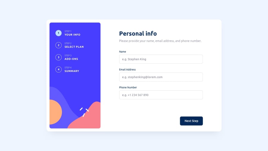
Design comparison
Solution retrospective
It took me about a day to do this project. I separated each part from the others, then merged them into one solution. First I made an HTML markup, styled it, and added TypeScript logic for validation and collection of data. After all, the parts were done, I left only the main container in HTML, and other parts were dynamically rendered by JavaScript. I made it so that when you are returning back to some step, your choices get saved. But the only problem is that your name in input gets cut off to one word, and I honestly don't know why.
Community feedback
- @AhmadYousif89Posted almost 2 years ago
Hi there, good job on finishing this challenge, these are just a couple of issues I noticed after viewing the website :
1- svgs are not being rendered (probably wrong src path) 2- no visual indication of the selected plan 3- the addons doesn't show up in the fourth step (summary) 4- can't click on the navigation buttons to go back or forward 5- the change button on the 4 step is supposed to switch the billing cycle not redirect the user to the 2 step (I know it's much easier the way you doing right now but it's really shouldn't be like that and it's not a good UI experience also). 6- steps (1 and 2) on mobile screens need some height adjustment (doesn't look good on some devices)
but overall I think the design looks good 👍
0@KaeserOfHonourPosted almost 2 years ago@AhmadYousif89 huh, as for svgs looks like a server issue, as on localhost they are rendering without problems. Problems, 2-4 are working well on my phone, laptop, and PC. Good take on problem 5, didn't think about it. And will look for problem 6. Thanks for your feedback.
0
Please log in to post a comment
Log in with GitHubJoin our Discord community
Join thousands of Frontend Mentor community members taking the challenges, sharing resources, helping each other, and chatting about all things front-end!
Join our Discord
