Design comparison
Solution retrospective
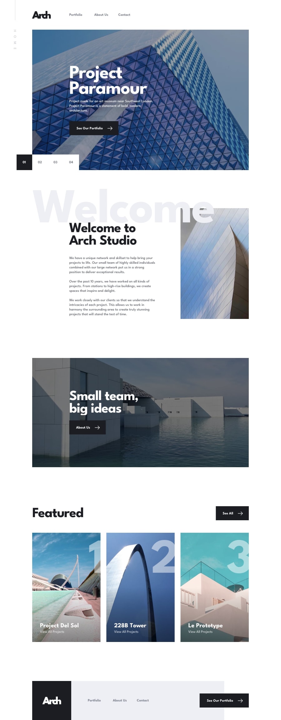
My first mutli-page website 🙌 there is some details I'm not 100% satisfied with but, next time I'll do it differently. The screenshot looks empty because of the on-scroll animations (Aos library, next time GSAP 👌). Any feedback is welcome.
Community feedback
- @adarshcodesPosted almost 4 years ago
Hi! @Antoine-Flo, You did amazing work on this challenge.
- I love the scroll animation you added
- Your solution is spot on, great work👏
- A small issue I noticed while checking the responsiveness it seems your site leaves extra blank space to the right side and when it comes to the mobile view, the navigation slider started showing up. (Idk, if it's my browser or a real issue).
- You can also solve the HTML and Accessibility issues. Nice work! Happy Coding : )
3 - @qb-rivkybPosted almost 4 years ago
Hey! I just looked at your solution after I did the same one. I noticed some hover and active states were missing. You can have a look at mine 😉.
1 - @ApplePieGiraffePosted almost 4 years ago
Hello, Antoine! 👋
Nice to see you complete another challenge! 😀 Great job on this one! 🙌
Congratulations on completing your first multi-page website (this was quite a project)! 🎉
Like, adarshcodes mentoined, there seems to be some extra space to the right of the content of the page on most of the pages, producing a horizontal scroll bar along the bottom of the screen. Also, I think it would be nice if the projects on the portfolio page were links (even if they don't go anywhere just yet). 😉
Other than that, everything looks great and responds well! 👍
Keep coding (and happy coding, too)! 😁
1
Please log in to post a comment
Log in with GitHubJoin our Discord community
Join thousands of Frontend Mentor community members taking the challenges, sharing resources, helping each other, and chatting about all things front-end!
Join our Discord
