


Design comparison
Solution retrospective
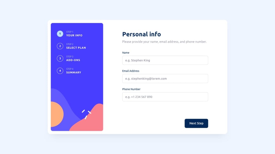
The key problem here was the buttons at the bottom of the page, particularly in the mobile view. They needed to be within the form element, so I gave them a fixed position at the bottom of the page, although they'll be in different positions depending on the browser. I had to move the 'monthy-yearly' toggler on the second page to fit them in better.
The general size and spacing of the elements was also difficult to get right. I estimated most of the them using margin and padding, but it would be better if they were more consistent. Maybe bootstrap would have been better here?
The functions work well, but maybe I needed fewer of them, or there are more efficient ways to get the same result ?
Community feedback
- @VictorBrito13Posted over 1 year ago
Maybe if you remove the position: absolute to the personal-info and selection-btns classes gonna help with the design
1

Please log in to post a comment
Log in with GitHubJoin our Discord community
Join thousands of Frontend Mentor community members taking the challenges, sharing resources, helping each other, and chatting about all things front-end!
Join our Discord