


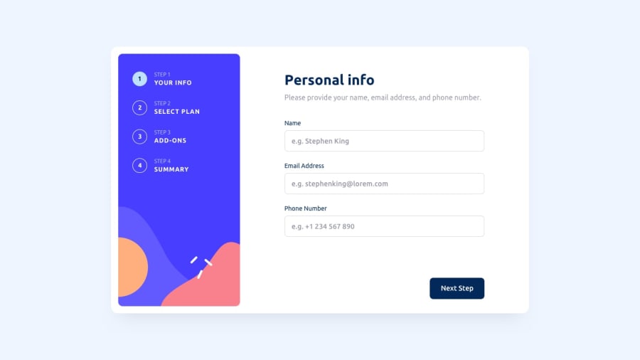
Design comparison
Community feedback
- @LanceLiang2011Posted over 1 year ago
Hello Geordy,
I must say that I'm truly impressed with the amount of work and detail you've put into this project - your solution is excellent! I do, however, have a couple of UX-related observations and a question for you.
Feedback:
I noticed that when hovering over the steps in your sidebar, my cursor changes to a pointer. However, these numbers are not clickable, which could potentially confuse users.
I experienced some screen flashing when I selected all add-ons on page 3 and then navigated to page 4. I'm unsure of what's causing this, but I believe it's something that needs to be addressed.
Question: Your project is a single page application, and you've chosen to use Astro.build as your framework. Can you share your specific reasons for this choice?
Overall, this is one of the best solution for this project I've seen on FM so far, Keep up the good work!
Marked as helpful2@elian-devPosted over 1 year ago@LanceLiang2011 hi,
Thanks a lot for your feedback!
Yeah, you have a point, I will try to add the change tab functionality and don't confuse the users.
With the other observation, it's weird, I couldn't replicate the problem that you mention, but I will be debugging what could be happening there.
And yeah I chose Astro just for learning reasons, I learning the framework at this moment and I wanted a challenging project in order to use most of the framework features. I know that if would be a real project there are other frameworks more convenient.
1@LanceLiang2011Posted over 1 year ago@elian-dev Thank you for your reply. For the second observation, it only happens when I use Firefox. It's fine on Chrome. Maybe it's my browser's issue.
Marked as helpful0 - @jamesekunolaPosted over 1 year ago
Hi Geordy, your ui look ok, but there are some issues you might need to address.
1 There is horizonatal overflow when device screen size is around 830px 2 users shouldn't be able to go to the next step if phone number isn't entered 3. The next button disapper when input is focused in page 1 on opera mini browser 3 input value for name shouldn't contain numbers or special characters. 4 in the add-ons on page 3 user should be able to still see their selected choice when they come back to page 3. 5 The color of the input when typing should be grey.
overall your ui is great, i love how you added animination to the pages. great work
Marked as helpful0@elian-devPosted over 1 year ago@jamesekunola hi,
Thanks for your feedback.
I have launched a new version, I hope to fix all issues that you mention
0@jamesekunolaPosted over 1 year agoHello Geordy, you've addressed the majority of the problems, but a few remain unresolved:
- There is still a horizontal overflow occurring at approximately 830 pixels screen size.
- The addon plans should retain the previously selected plans when the user clicks on the "change plan" option in step 4.
would love to send you a picture to explain more on the horizontal overflow but i don't know how to do that here.
0


Please log in to post a comment
Log in with GitHub
Join our Discord community
Join thousands of Frontend Mentor community members taking the challenges, sharing resources, helping each other, and chatting about all things front-end!
Join our Discord