Not Found
Not Found
Not Found
Not Found
Not Found
Not Found
Not Found
Not Found
Not Found
Not Found
Not Found
Not Found
Not Found
Not Found
Not Found
Not Found
Not Found
Not Found
Not Found
Not Found

Submitted

Multi Step Form--HTML,CSS,JavaScript

sheriβ€’ 220

@sheri0441

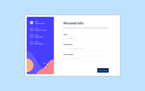
Desktop design screenshot for the Multi-step form coding challenge

This is a solution for...

  • HTML
  • CSS
  • JS
4advanced
View challenge

Design comparison


SolutionDesign

Solution retrospective


The project was built with simple HTML, CSS, and JavaScript.

Have any suggestions, please let me know.

Community feedback

Jo89 πŸ˜ˆβ€’ 380

@AhmadYousif89

Posted

Hi Sheri πŸ‘‹

Your solution looks great πŸ‘ I just have a couple of notes regarding the styling and the functionality of your app and I hope you find them useful to you :

  • the top and side navigation elements (currently they doesn't really add or serve any useful propose other than displaying info about the current step) would be a better user experience if they were actually navigation button that navigate between the steps πŸ˜‰

  • it would be much better experience if the user can navigate and select/check with keyboard ⌨

  • consider making the change button on the last step to actually change the billing cycle (not just sending the user back to step 2 to manually changing the bill cycle) because that's the intended behavior of this button.

btw I see you have an error on the console when changing the billing cycle 😐

Marked as helpful

1

sheriβ€’ 220

@sheri0441

Posted

@AhmadYousif89 Thanks for Guidance! Especially the last one.

1
Jo89 πŸ˜ˆβ€’ 380

@AhmadYousif89

Posted

@sheri0441

I just took a look at your code and I noticed that it's not properly formatted (maybe I'm wrong not sure) but I think prettier (vscode extension) would be a very good formatting tool πŸ˜‰ for you or any dev actually

Marked as helpful

0
P
visualdennisβ€’ 8,375

@visualdenniss

Posted

Hey, you submission looks great!

Two suggestions regarding the user experience: You can have a default option selected for add-ons for users, which is a very common practice. Also you can put cursor:pointer; to those plan selection options to indicate users that it is clickable area. Other than that, it works really good.

Hope you find this feedback helpful!

Marked as helpful

1

sheriβ€’ 220

@sheri0441

Posted

@visualdenniss Thank you very much.

0

Please log in to post a comment

Log in with GitHub
Discord logo

Join our Discord community

Join thousands of Frontend Mentor community members taking the challenges, sharing resources, helping each other, and chatting about all things front-end!

Join our Discord