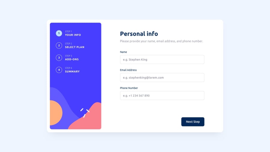
Design comparison
Solution retrospective
In this project I tried to solidify my knowledge about React and CSS. The summary page was tricky to do, but in the end I think I did it well enough.
Community feedback
- @cscheungaePosted over 1 year ago
Thank you for giving a very detailed feedback on my solutions. Now, this is my turn. Here is my feedback, tho not as through as yours gave to me.
Say if I select "Advanced plan", then click next to goto "Pick add-ons". Then, I click "go back". In my browser, both the "Arcade" plan & "Advanced" are selected in visual (highlighted in purple).
Overall, well done!
Marked as helpful0@JagholinPosted over 1 year ago@cscheungae One is focused, other one is selected(they have slightly different backgrounds). But yes its a problem because these states are visually similar, I think I will fix it sometime soon. In my defence, most of the colors in the pallette that we are given are very similar to each other, I have trouble differentiating between them on my $350 monitor
0
Please log in to post a comment
Log in with GitHubJoin our Discord community
Join thousands of Frontend Mentor community members taking the challenges, sharing resources, helping each other, and chatting about all things front-end!
Join our Discord