Design comparison
Solution retrospective
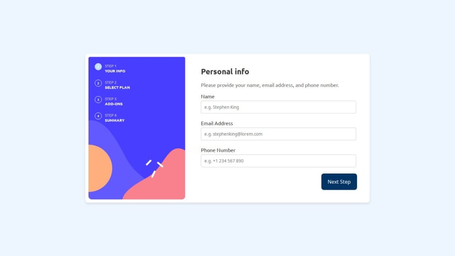
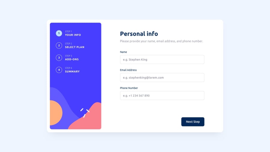
I'm glad I got this done. It was an educational experience. I learned that I need to make a better plan next time before I start doing anything. It became difficult towards the end when I started messing up with the classes and the structure got messy. Next time, I'll work with a mobile-first approach, as I usually do. It seems that when I had to adapt the desktop version to mobile, many things became messy.
What challenges did you encounter, and how did you overcome them?There were many challenges, and I had to use YouTube tutorials and ChatGPT a lot to find solutions for them. One thing remains unsolved. I couldn't get the background color of the circles to change when moving from one step to another. I hope to find a solution for that eventually.
Community feedback
Please log in to post a comment
Log in with GitHubJoin our Discord community
Join thousands of Frontend Mentor community members taking the challenges, sharing resources, helping each other, and chatting about all things front-end!
Join our Discord
