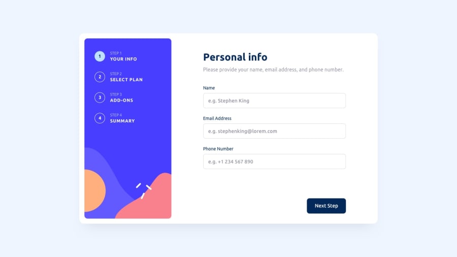
Design comparison
Solution retrospective
I think I did a good job with the JS logic in general, especially with the form validations. I think the css file could be neater and less confusing. I also think the mobile design is fine, but it could definitely be improved.
What challenges did you encounter, and how did you overcome them?The responsive design took longer than I thought it would. Having the form container with position: absolute overlapping the current step container gave me more than one headache. I was able to solve it by trial and error and, in the case of very small resolutions, sacrificing some design for better user accessibility.
What specific areas of your project would you like help with?Any help or advice is welcome! Whether it's about React, CSS or HTML.
Community feedback
- @SvitlanaSuslenkovaPosted 3 months ago
Hi, you can add max-width and max-height to you <main> They don't replace width, they work together. Hope you found this comment helpful :)
Marked as helpful1 - @Sarah-okoloPosted 3 months ago
Hi, you might want to check out the format you specified for the phone number input field. I tried different phone number formats, even the example shown in the placeholder, but it still kept saying "invalid phone number format"
1@nanopivaPosted 3 months agoYes, I would have to change the placeholder and the instruction to make the pattern clearer and more obvious. It probably shows you error because the phone input doesn't recognise blanks. Thanks for the feedback :)
0 - @grace-snowPosted 3 months ago
It's an accessibility requirement to use autocomplete attributes on the fields that collect personal data.
There are also fieldset groupings missing like on the checkboxes.
I'd need to go through this more carefully but there are a lot of accessibility requirements in this challenge. I recommend some careful testing with keyboard and screen readers.
0@nanopivaPosted 3 months agoSure, there are some accessibility issues I should fix, as you said. Sometimes I get so focused on the JS logic that I forget these important HTML basics. Thanks for the feedback, when I have some time I'll fix these issues.
0
Please log in to post a comment
Log in with GitHubJoin our Discord community
Join thousands of Frontend Mentor community members taking the challenges, sharing resources, helping each other, and chatting about all things front-end!
Join our Discord
