Design comparison
Solution retrospective
Hello!
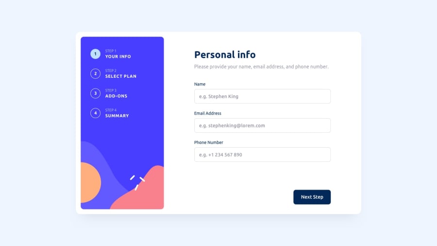
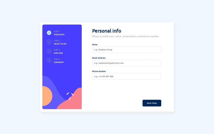
This is my solution for the Multi Step Form, it has some rough edges here and there, but it works as expected. The mobile view doesn't look exactly like it is supposed to look, I had to change a lot of things for that to happen, but for now I'm satisfied with the result. Also do you think this is a good portfolio project for a first job ?
Any feedback is well accepted!
Community feedback
- @awexliPosted almost 2 years ago
Love the form validation and simulating the loading after submit :-) I think it would make a great piece on a portfolio. Forms and similar types of step functionalities are quite common in many web applications. Another great piece would be to have project that includes interaction with a backend API.
Some minor feedback:
- You have a typo for the label 'Email Address' (missing one more
d
) - In mobile view, step 2, there is a layout shift when changing between monthly/yearly plans. This pushes all the buttons down and some below the card, and in general is not the best user experience
- In step 3, it doesn't allow me to select/unselect an option if I click on the number (
10/yr, 20/yr
), even though it gives me a visual feedback that I did click on it
Marked as helpful1@CatalinBaniciPosted almost 2 years ago@awexli Many thanks for the feedback! 🙏 I will make sure to fix those issues.
0 - You have a typo for the label 'Email Address' (missing one more
Please log in to post a comment
Log in with GitHubJoin our Discord community
Join thousands of Frontend Mentor community members taking the challenges, sharing resources, helping each other, and chatting about all things front-end!
Join our Discord