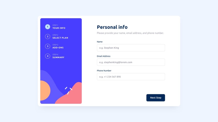
Design comparison
Solution retrospective
This was a lot of fun. With the result I am satisfied, with the code quality not that much. Although a rather small (mini) project, it started to grow in complexity when the various states of the pages had to be saved and loaded correctly. A little bit of architecture (maybe a very simple MVC setup) could have made life easier, I guess?
If you like, tell me what you think :)
Community feedback
- @KingsleyChukwuPosted over 1 year ago
Nice layout and functionalities....But I suggest you should have activated the required attribute when the next step button is clicked. And it might also help to resize the height of the body so that it doesn't overflow.
1@obssessoPosted over 1 year ago@KingsleyChukwu Thanks Joseph. I would like to understand your feedback better. What do you mean with activating the "required" attribute? As I see it it's already activated where it needs to be (Step 1). Can you also elaborate on the overflow, because I couldnt find overflowing elements.
Again, thanks for taking your time :)
EDIT: I found overflow in between 750 and 900px. But I think thats to do with the grid width. Is that what you meant?^^
EDIT2: Oooh, I see, something has broken in my input tags on the form in the first step. No idea, when that happened, but you were right about the "required" attributes. Thanks for pointing it out :)
0 - @Yond1Posted over 1 year ago
great animation checkbox)
1@obssessoPosted over 1 year ago@Yond1 Hey, thank you :) More or less stole it from Sara Soueidan^^ (see: https://www.sarasoueidan.com/blog/inclusively-hiding-and-styling-checkboxes-and-radio-buttons/#adding-delight-using-svg-animations)
1
Please log in to post a comment
Log in with GitHubJoin our Discord community
Join thousands of Frontend Mentor community members taking the challenges, sharing resources, helping each other, and chatting about all things front-end!
Join our Discord
