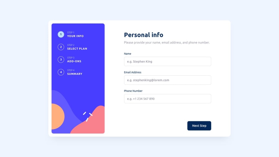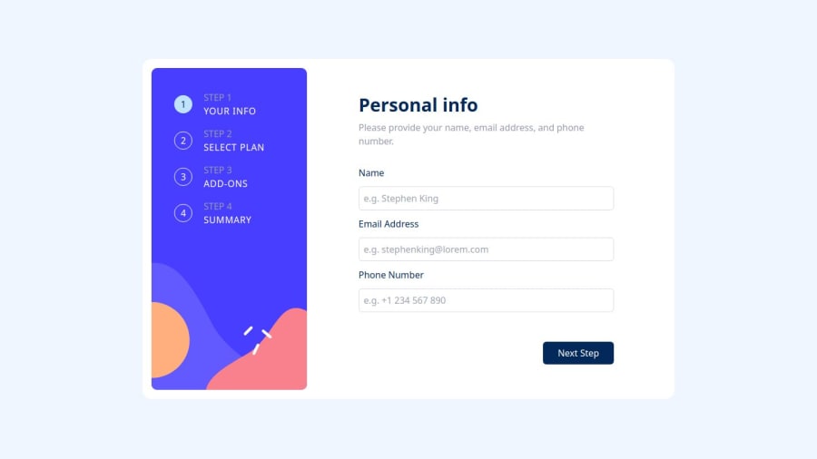
Design comparison
Solution retrospective
I build this forms to multi page project and using url passing state variables, it's great exercise to check values and functions and then display the style, I am satidfied with the output.
Community feedback
- @Mahmoud-ElagamyPosted 3 months ago
Thank you for your hard work on this project. I've been using the application and have a few suggestions for improvement:
Validation Messages: When I enter an invalid value into a field, the error message "This field is required" can be misleading. It would be more helpful if the message provided specific guidance, such as "Please enter a valid [data type], e.g. [example]." This would help users understand the expected input format and avoid errors.
Data Persistence: When I navigate to a different step and then return to a previous one, any changes I've made are not saved. This can be frustrating, as it requires me to re-enter information. It would be beneficial if the application could automatically save user input as they progress through the steps.
I believe that these improvements would enhance the overall user experience and make the application even more valuable. Good luck!
Marked as helpful0
Please log in to post a comment
Log in with GitHubJoin our Discord community
Join thousands of Frontend Mentor community members taking the challenges, sharing resources, helping each other, and chatting about all things front-end!
Join our Discord