

Design comparison
SolutionDesign
Solution retrospective
What specific areas of your project would you like help with?
Hello,
Here's my solution to this challenge. Any feedback would be appreciated.
Thanks.
Community feedback
- @Mahmoud-ElagamyPosted 5 months ago
Hi Fred,
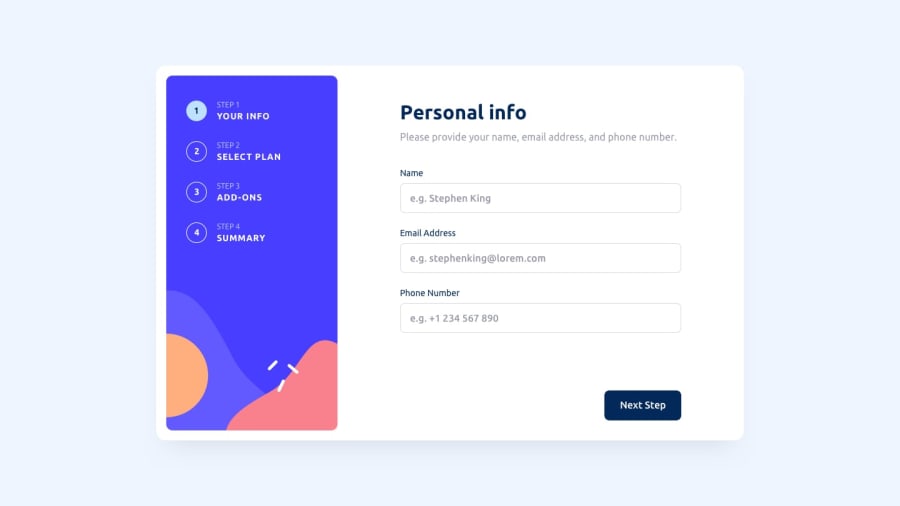
Overall, the multi-step form is well-designed and easy to navigate. However, I noticed that the active state for the selected plan isn't visually distinct enough. It would be beneficial to enhance the visual indicator to make the user's choice more apparent.
This small improvement would significantly enhance the user experience by providing clearer confirmation of their selection.
Marked as helpful2

Please log in to post a comment
Log in with GitHubJoin our Discord community
Join thousands of Frontend Mentor community members taking the challenges, sharing resources, helping each other, and chatting about all things front-end!
Join our Discord