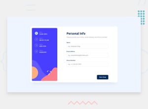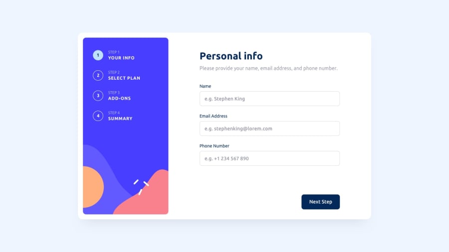
Design comparison
Solution retrospective
Hey guys,
Please have a look at my solution and let me know if you have any feedback in regard to the JavaScript/React hooks being used to complete this project.
I did spend a significant amount of time on the CSS. That said, if you look closely, some things are a bit off in comparison with the example. I did not adjust this on purpose. The reason is that adjusting the CSS will again take a lot of time and no new knowledge will be obtained. Let's focus on the functionality instead :)
Also, I played around with Yup and Formik a bit. This wasn't part of the challenge, however, I wanted to test out a few things. That is why you need to provide (fake) details in order to move to the second slide.
Thanks for checking and have a nice day!
Community feedback
Please log in to post a comment
Log in with GitHubJoin our Discord community
Join thousands of Frontend Mentor community members taking the challenges, sharing resources, helping each other, and chatting about all things front-end!
Join our Discord
