Design comparison
Solution retrospective
I finished my 6th project.
But this project has some flaws and I couldn't fix it, please help me.
Community feedback
- P@KrishnaVishwakarma1595Posted about 1 year ago
Hi, @newNASA
Nice solution. I've few recommendations for you -
-
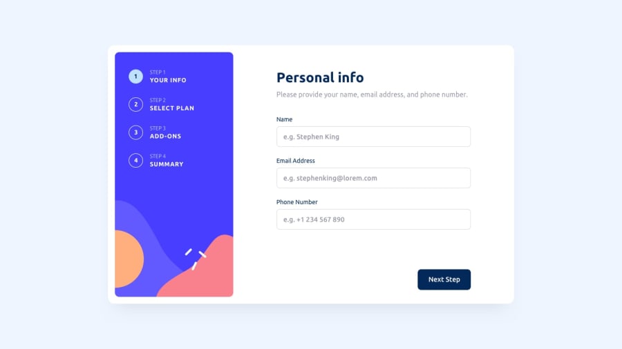
You should add form validation on first step. As, we can enter wrong email format and in phone number we can enter texts also. For email validation, you can use any email validation regex and for phone number field you can use input
type="number"withminlength=12. So, it will allow user to enter numbers only. -
Or for the phone number you can keep the input
type="text", and on thekeypressevent listener you can check to allow only numbers and the plus icon. As sometimes, we can enter phone numbers with country codes like this+041,+91. -
You can do the calculation part too. As I can see in step 4 it has just a static value. So, keep a calculation on previous steps of what plan and add-ons the user selects and on the finishing step show the correct calculation.
-
On the confirmation button, you should also show the Thank you message. I think you've skipped that part.
I hope these points will help you to improve your solution.
Happy Coding
Marked as helpful1 -
Please log in to post a comment
Log in with GitHubJoin our Discord community
Join thousands of Frontend Mentor community members taking the challenges, sharing resources, helping each other, and chatting about all things front-end!
Join our Discord
