Design comparison
SolutionDesign
Community feedback
- @Sarah-okoloPosted 3 months ago
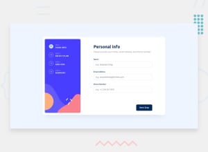
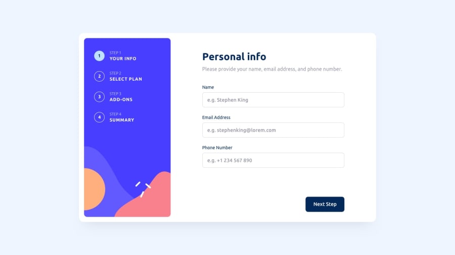
Nice solution. You should consider adding a max width to your form card to prevent it from overstretching on wider screens. max-width: 900px should do.
Marked as helpful0
Please log in to post a comment
Log in with GitHubJoin our Discord community
Join thousands of Frontend Mentor community members taking the challenges, sharing resources, helping each other, and chatting about all things front-end!
Join our Discord
