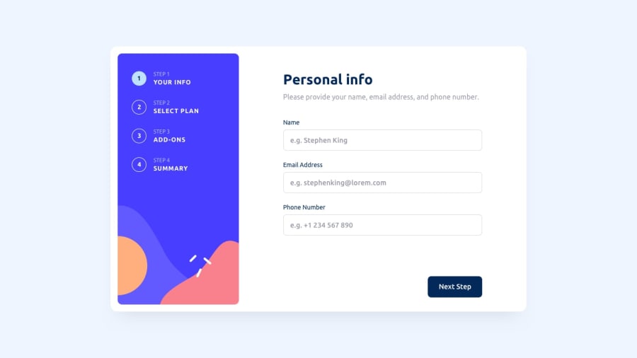
Design comparison
Solution retrospective
Hi! I had a lot of fun building this project, and have spent the last couple of days working on it. If you wish to see my process, feel free to check out the GitHub repository, as I have written my entire thought process, along side what I did poorly and what I did great.
I also have fully commented code over there as well.
Community feedback
- @tomazi15Posted over 1 year ago
@Corbinhol
Really good functionality and design, I would break it up into components it would be easier to maintain and manage.
A very good practice is to always add form validation because at the moment the user can enter anything, ie invalid email, name or pone number, You could start with something very simple that html gives you out of the box in you email input can be set to
type="email"or phone number totype="number"this would make sure that the user is forced to enter valid email and for phone user has to enter numbers only, also the form can be submitted without entering any dataJust few things to consider but overall well done and keep it up
1
Please log in to post a comment
Log in with GitHubJoin our Discord community
Join thousands of Frontend Mentor community members taking the challenges, sharing resources, helping each other, and chatting about all things front-end!
Join our Discord
