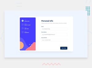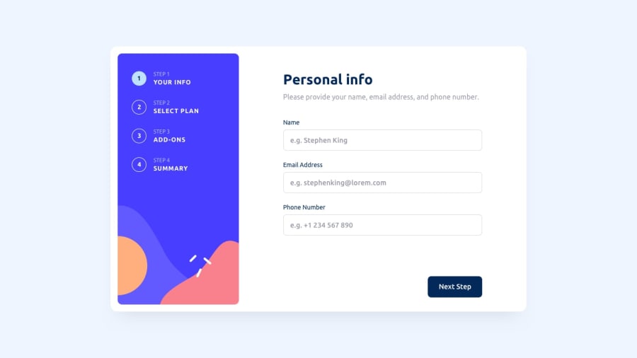
Design comparison
SolutionDesign
Community feedback
- @jaduraniPosted 10 months ago
Hello, I looked at your solution and have a few comments:
Phone number field
- I could enter letters
- I could enter a single character and it passes
Next Button
- On hover, it turns purple. It should be
#164A8A
Yearly / Monthly Toggle
- Color should be
#022959
Form Steps (The form numbers on the side)
- Active form steps don't have white borders on the design
Hope you find these comments helpful. Overall, congrats on your submission! 🎉
Marked as helpful1@evertznerPosted 10 months ago@jadurani thanks for your comment
I didnt put that much in validation, but was conscious that more things could be done.
Regarding the colors, tried to use those provided by the files you download when you start the challenge. I dont have pro account, therefore i dont have access to figma with detailed info about coloring
1
Please log in to post a comment
Log in with GitHubJoin our Discord community
Join thousands of Frontend Mentor community members taking the challenges, sharing resources, helping each other, and chatting about all things front-end!
Join our Discord
