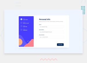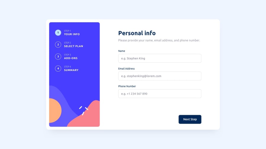
Multi-step form
Design comparison
Community feedback
- @cyber-mPosted 6 months ago
Hey @fernandogadebarros, Great job! I really like how structured your project and how data is separated from functionality. I notice couple small things that you can fix real quick: The text of the last step button should be "Confirm" instead of "Next" I think the hover state of the text field should be with a purple border One way that was really helpful for me in order to match better the design is to put the design images in Figma, measurements are much easier that way.
Marked as helpful0@fernandogadebarrosPosted 6 months agoHi @cyber-m, how are you? Firstly, thank you very much for your comment; it is very useful for me. I actually forgot some small details of the project and I'm very excited to join this platform. I believe that the people here will help me a lot. Thank you for thoroughly analyzing my project. I was very happy with your feedback!
1@cyber-mPosted 6 months ago@fernandogadebarros Thank you for the reply, I really appreciate it.
0
Please log in to post a comment
Log in with GitHubJoin our Discord community
Join thousands of Frontend Mentor community members taking the challenges, sharing resources, helping each other, and chatting about all things front-end!
Join our Discord
