

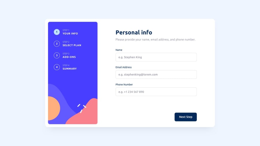
Design comparison
Solution retrospective
This is my very first vuejs project.I am so boring with reactjs so I decided to learn new library and learned vuejs by reading official documentation and built it within three days. I would love to hear you feedbacks and suggestions.
Community feedback
- @sakhshijanPosted over 1 year ago
you done very nice, but missed step 2 responsive version.
0@zwelhtetyanPosted over 1 year ago@Saeed1112 I have already done with responsive layout and also in step 2.Could you please tell me where is missing part ?
0@sakhshijanPosted over 1 year ago@zwelhtetyan in mobile sample design step 2 (Plan selection) is in a row version, yours is Column version both in mobile and desktop view.
0@zwelhtetyanPosted over 1 year ago@Saeed1112 oh! I think you point out for column section on medium device. I change it to row only in mobile device (under 480px). It is a bit looking good than column for me in medium devices.
0@sakhshijanPosted over 1 year ago@zwelhtetyan its up to you how make this work. i thought it's a mistake :)
0@zwelhtetyanPosted over 1 year ago@Saeed1112 I thought it might not be a mistake. It is also totally up to you.
0

Please log in to post a comment
Log in with GitHub
Join our Discord community
Join thousands of Frontend Mentor community members taking the challenges, sharing resources, helping each other, and chatting about all things front-end!
Join our Discord