Design comparison
SolutionDesign
Community feedback
- @dylan-dot-cPosted about 1 month ago
Well done!
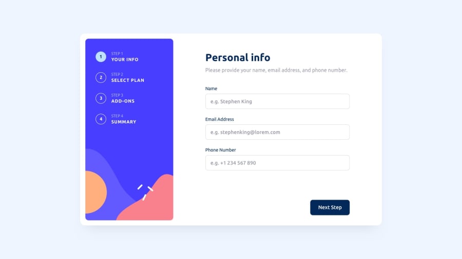
Everything looks good! Only visual issue would be the background color and the form not being fully cantered in the screen.
For this challenge, I did mine using react and framer motion for the animations. Another issue would be the phone number input In the pattern attribute the regex you have, is short of 1 character so I was a bit confused why my number was invalid the last part should [0-9]{4} not [0-9]{3}
Other than that, its good
Also feel free to check out mine and comment on it
0
Please log in to post a comment
Log in with GitHubJoin our Discord community
Join thousands of Frontend Mentor community members taking the challenges, sharing resources, helping each other, and chatting about all things front-end!
Join our Discord
