Submitted almost 3 years agoA solution to the Multi-step form challenge
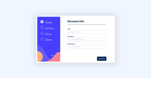
Multi step and responsive form using ReactJS
react, sass/scss
@Vee339

Solution retrospective
This project was a little challenging for me and I enjoyed it a lot.
However, I have 3 main doubts regarding it.
- How will I write required in red when the user clicks on Next Step without filling required fields?
- I could not make the plan type change (monthly or yearly) with the central toggle button.
- I could not style the buttons properly because I inserted them in the content div, they were creating problems in the mobile version. And if I was putting them outside the content div, then I had no idea how to style them in the laptop version.
Code
Loading...
Please log in to post a comment
Log in with GitHubCommunity feedback
No feedback yet. Be the first to give feedback on Veerpal Kaur's solution.
Join our Discord community
Join thousands of Frontend Mentor community members taking the challenges, sharing resources, helping each other, and chatting about all things front-end!
Join our Discord