Design comparison
SolutionDesign
Solution retrospective
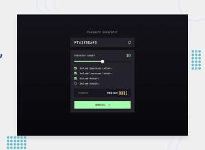
I've used Mui material on this project to get used to its components and have made a few adjustments on the UI compared to the design provided, such as copied feedback and color of the strength text.
Any feedback is welcome =)
Community feedback
Please log in to post a comment
Log in with GitHubJoin our Discord community
Join thousands of Frontend Mentor community members taking the challenges, sharing resources, helping each other, and chatting about all things front-end!
Join our Discord
