Submitted over 2 years ago
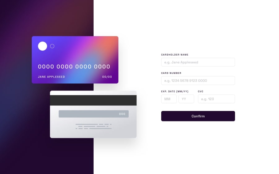
Mostly responsive, interactive credit card form
@realMecoy
Design comparison
SolutionDesign
Solution retrospective
Hello ladies and gents, I had a particularly hard time with the responsive section on this challenge because of the absolute positioning. I would really appreciate it if anyone could tell me where I could improve my CSS. I would also really appreciate it if anyone could show me how I could refactor my javascript...
Community feedback
Please log in to post a comment
Log in with GitHubJoin our Discord community
Join thousands of Frontend Mentor community members taking the challenges, sharing resources, helping each other, and chatting about all things front-end!
Join our Discord
