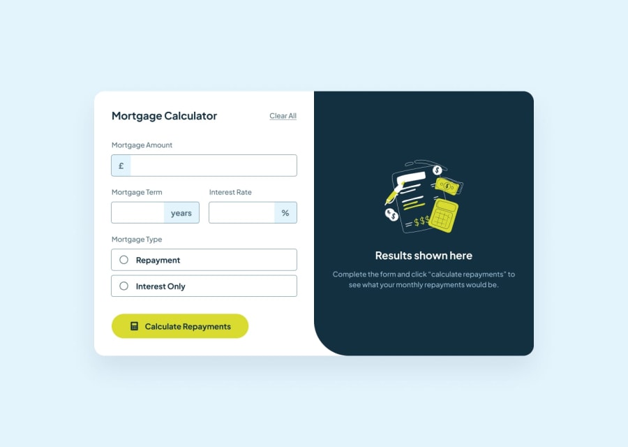
Mortgage_repayment_calculator - next js 14, tsx, shadcn
Design comparison
Solution retrospective
I'm most proud of the different ui states of the input boxes. I learnt how to use them based on the user's interaction.
I felt I did a brute method for the state management and form validation. Would like to refine it the next time. I will use Zod for the form validation.
What challenges did you encounter, and how did you overcome them?Form validation became a bit challenging. I didn't want to show the inputs as numbers as it gives a inc/dec btn at the end. so I kept them as text, so performing math equations were tough, as I had to decide at what point to convert the strings to numbers.
Community feedback
- @BettoRaitePosted about 2 months ago
Things I like:
- Nice website responsiveness (mobile, tablet, pc).
- Good padding/margin.
- Text looks pleasing.
Things I do not like:
- No hand pointer on mortgage type options except input itself.
- No transition of inputs from base form to focused.
- No hand pointer on calc button.
- result hint is a bit hard to read. (bigger font-size)
Personal recommendation: Think you can make the challenge harder? Not the type of completed, forgot it. (well you decide, mb, want better challenge.)
Btw, zod is cool. Definitely give it a try. You can start with the official docs.
1
Please log in to post a comment
Log in with GitHubJoin our Discord community
Join thousands of Frontend Mentor community members taking the challenges, sharing resources, helping each other, and chatting about all things front-end!
Join our Discord
