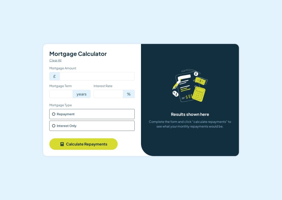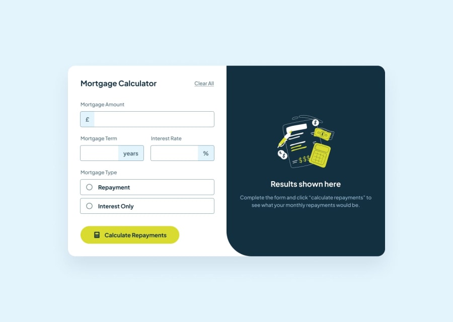
Design comparison
SolutionDesign
Solution retrospective
What are you most proud of, and what would you do differently next time?
I am very proud of everything I am learning and implementing, I really liked this project.
What challenges did you encounter, and how did you overcome them?I found the formulas for the calculations to be a challenge
What specific areas of your project would you like help with?any feedbacks is welcome
Please log in to post a comment
Log in with GitHubCommunity feedback
No feedback yet. Be the first to give feedback on rocio's solution.
Join our Discord community
Join thousands of Frontend Mentor community members taking the challenges, sharing resources, helping each other, and chatting about all things front-end!
Join our Discord
