Design comparison
SolutionDesign
Solution retrospective
What are you most proud of, and what would you do differently next time?
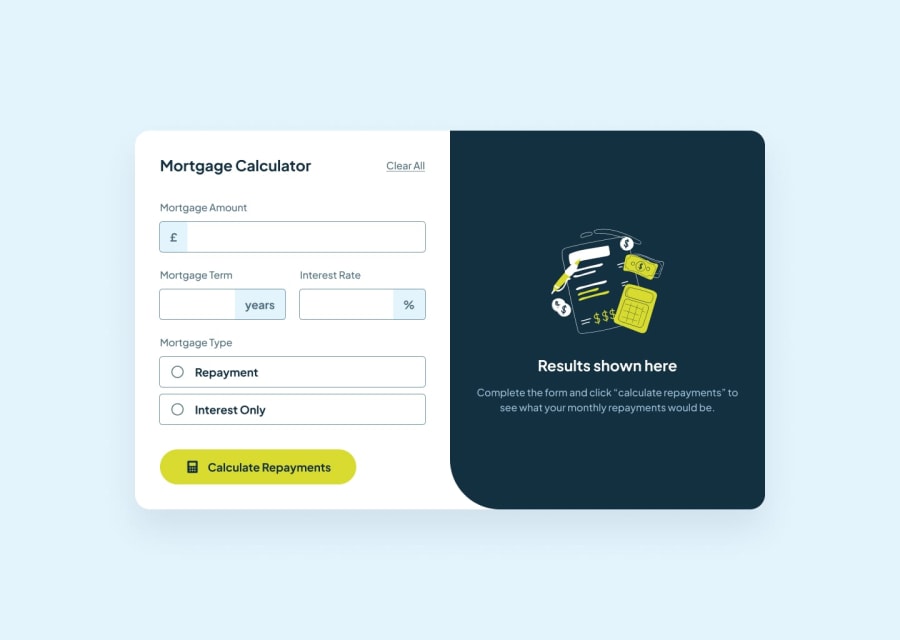
Not pixel perfect but I'm pleased with the outcome. Also, I added extra info at the output.
What challenges did you encounter, and how did you overcome them?I wish the included style-guide file offered a bit more help. Obviously if they do that you wont need a PRO account but it's a same to have colours missing.
Community feedback
Please log in to post a comment
Log in with GitHubJoin our Discord community
Join thousands of Frontend Mentor community members taking the challenges, sharing resources, helping each other, and chatting about all things front-end!
Join our Discord
