Design comparison
Solution retrospective
this is my first Intermediate project , and being able to use my previous experience built a pattern inside my head to do certain things in the best way
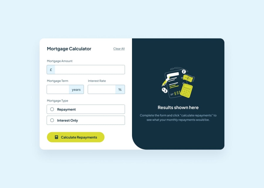
What challenges did you encounter, and how did you overcome them?the whole form thing is so hard to do , i'm i dumb or this is among all the developers i don't know , being able to stack the label above the input was a pure pain , i just used flex for the most of the things
What specific areas of your project would you like help with?I would like to know why form elements behaves in a strange way like the input and the label elements ; strangely the input type of numbers does not accept something like commas like ha? why? it is a number . so i converted the whole thing to a text then i validate the inputs in the javascript.
the project took me 10 days because i tried to shorten the css and improving the whole thing (html , css , javascript) so i'm really asking for criticism and review, i'm 101% sure that i could have done better code so please tell me what went wrong and how should i improve my code.
Community feedback
Please log in to post a comment
Log in with GitHubJoin our Discord community
Join thousands of Frontend Mentor community members taking the challenges, sharing resources, helping each other, and chatting about all things front-end!
Join our Discord
