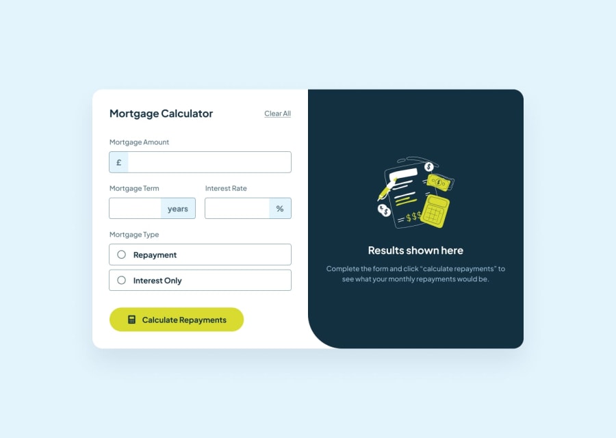
Design comparison
Solution retrospective
I'm happy that I was able to complete the project although it took me some time. Next time, I'll use a framework, not just vanilla CSS and vanilla JavaScript.
What challenges did you encounter, and how did you overcome them?I was faced with the challenge of validating the form. I was able to overcome the challenge with the help of mdn, stack overflow and critical reasoning
What specific areas of your project would you like help with?None
Community feedback
- @AdrianoEscarabotePosted about 1 month ago
Hi Caleb Arodu, how’s everything? I think your project turned out great! However, I have some feedback that I think might be useful:
A document ought to have one primary landmark, and the absence of a main tag around the page's primary content is the root of this issue. On this page, there is no other element that is more important than the one that this challenge is based on, so to solve it, wrap all the content in the'main' tag.
It's always a good idea to pay close attention to the proper use of semantic html elements because they are crucial for screen reader users to understand what the main content of the page is in the case of the'main' tag!
But overall everything is very good!! The calculator logic is spot on!
The rest is amazing.
I hope this is helpful. 👍
Marked as helpful0
Please log in to post a comment
Log in with GitHubJoin our Discord community
Join thousands of Frontend Mentor community members taking the challenges, sharing resources, helping each other, and chatting about all things front-end!
Join our Discord
