Design comparison
SolutionDesign
Solution retrospective
What are you most proud of, and what would you do differently next time?
I'm most proud of that I finally understand how to use the useState hook.
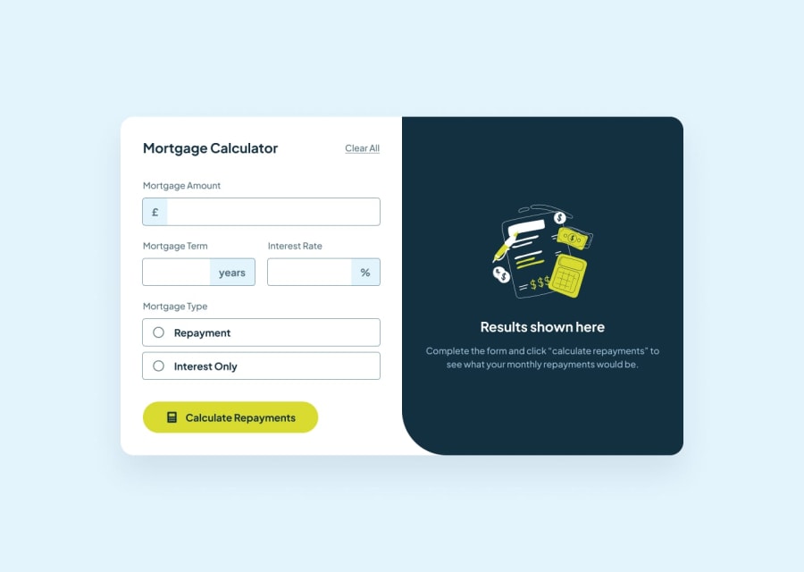
What challenges did you encounter, and how did you overcome them?Several challenges, but the most annoying was to fix the symbols year and % inside the input-form box. To overcome it I used the position:relative to the parent container and position:absolute for the children container. It apparently worked, but when the user minimize the screen, the symbols move slightly. To fix this I fixed the size of the main container. I did the same for the mobile version.
What specific areas of your project would you like help with?I'd like to know if the approach that I described above is the best one, or if there's a better solution for that.
Community feedback
Please log in to post a comment
Log in with GitHubJoin our Discord community
Join thousands of Frontend Mentor community members taking the challenges, sharing resources, helping each other, and chatting about all things front-end!
Join our Discord
