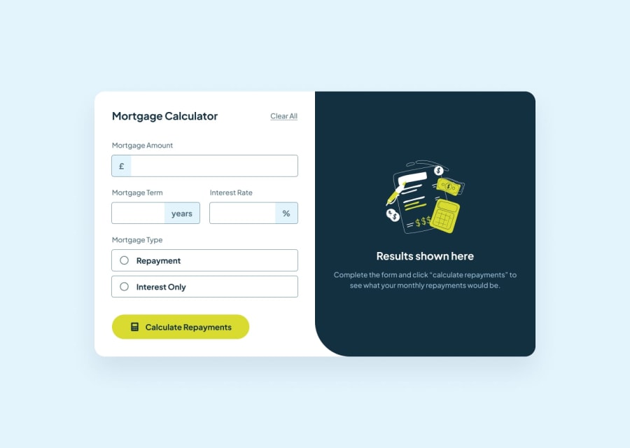
Design comparison
SolutionDesign
Solution retrospective
What are you most proud of, and what would you do differently next time?
I thought finishing it was enough to be proud. I think making the result side needed to be inside of a div with the other side not two seperate sections which made the stye pretty seperate and made it hard.
What challenges did you encounter, and how did you overcome them?Making both components match up
What specific areas of your project would you like help with?Best practices for the code itself
Community feedback
Please log in to post a comment
Log in with GitHubJoin our Discord community
Join thousands of Frontend Mentor community members taking the challenges, sharing resources, helping each other, and chatting about all things front-end!
Join our Discord
