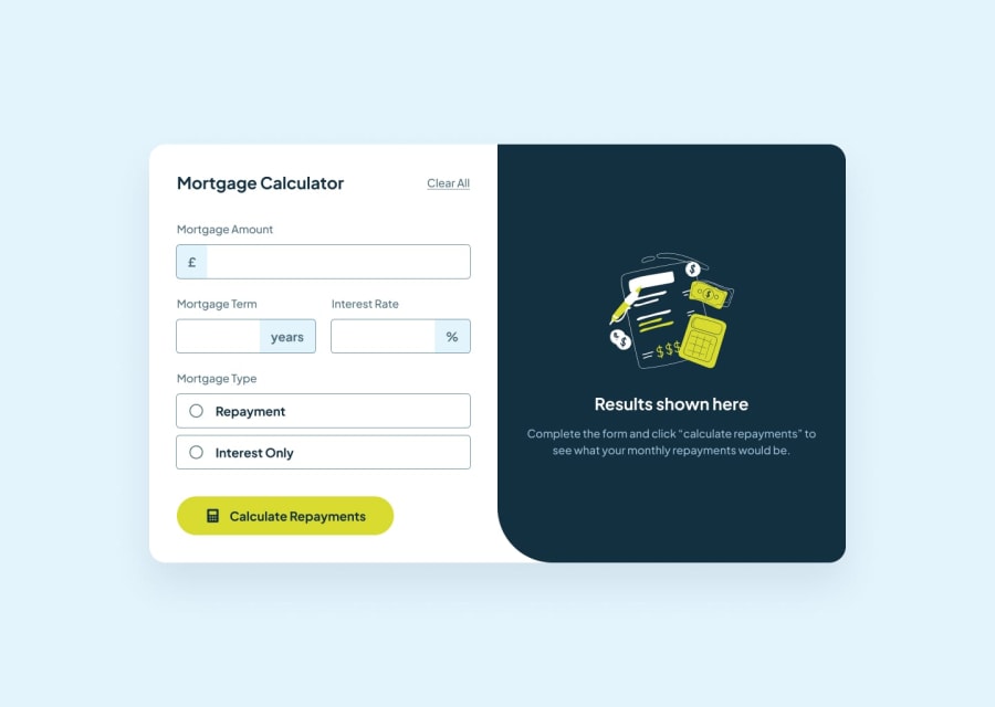
Design comparison
Solution retrospective
I am most proud of implementing the app in a way that allowed for large numbers to be used. The design for the mortgage calculator did not allow for large numbers to fit within the confines of the container(div) that I had. So I used the following properties to do just that...
overflow: hidden; text-overflow: ellipsis;
Although the app will only allow you to enter a number smaller than 10 million
What challenges did you encounter, and how did you overcome them?The biggest challenge was maintaining the responsiveness of the app while containing large numbers in the blue results box. As I mentioned previously, I used the properties 'overflow: hidden' and 'text-overflow: ellipsis;' to cut part of the numbers if they overflowed their initial containers.
I also implemented a popup box that displays the entire number if the initial container is too small for the number. All you have to do is hover over the number, and the popup box will appear.
What specific areas of your project would you like help with?I tried my best to keep the responsiveness of the app while making sure that large numbers fit within the confines of my containers. But if someone believes there is a better way of doing this, then please let me know.
Community feedback
Please log in to post a comment
Log in with GitHubJoin our Discord community
Join thousands of Frontend Mentor community members taking the challenges, sharing resources, helping each other, and chatting about all things front-end!
Join our Discord
