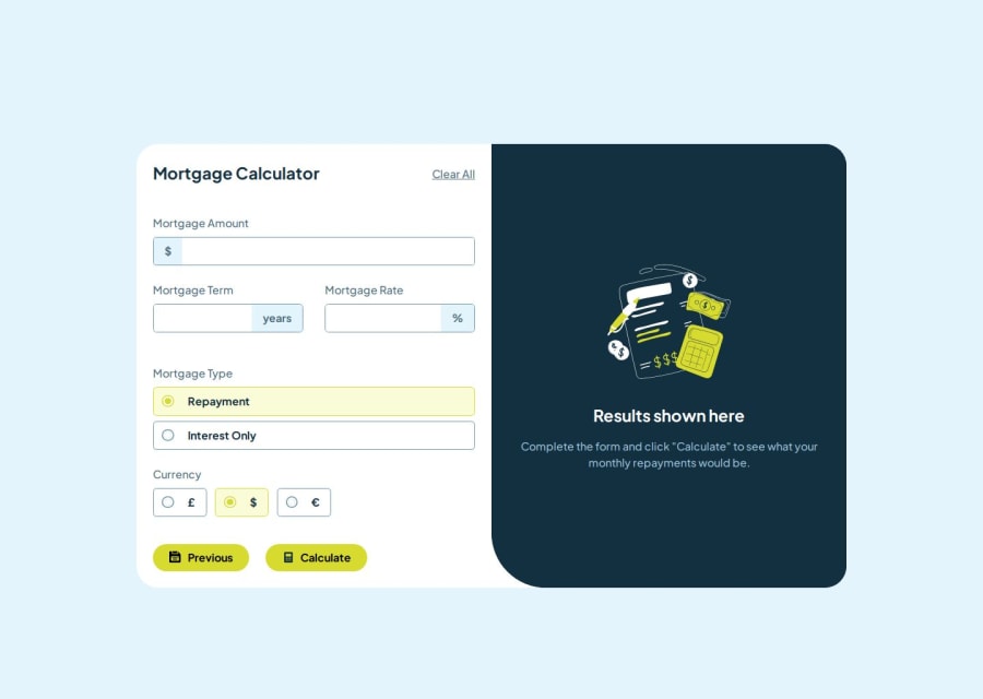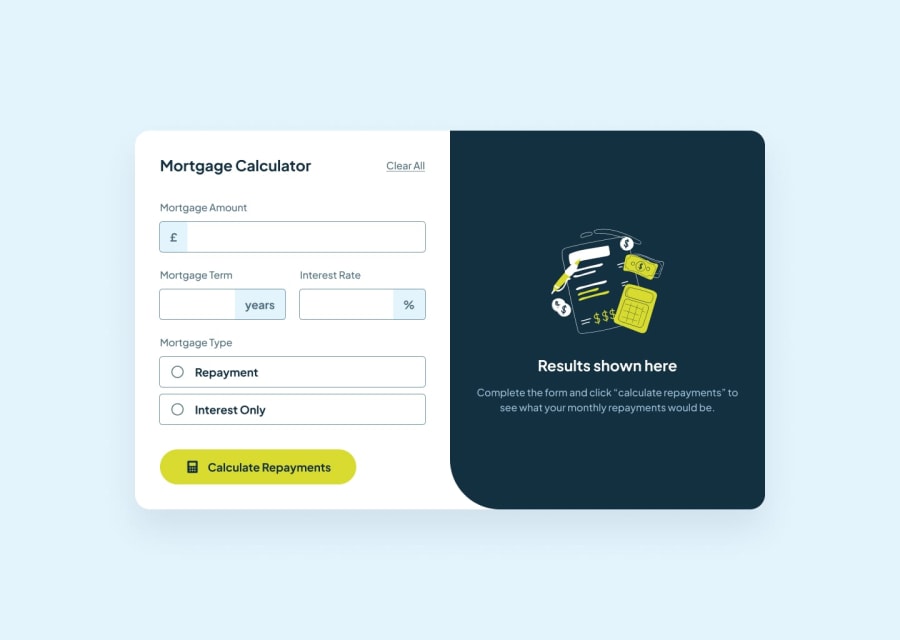
Mortgage calculator with TypeScript and CSS
Design comparison
Community feedback
- @Geo-BoldPosted 6 months ago
Hi Ilya,
Your implementation is both clean and responsive! I am unsure as to whether this was an intentional design choice, but the
inputsin the Currency section appear to be left justified instead of centered. Additionally, the position of the "Clear All" button is not easy to spot on mobile devices. Perhaps consider moving it to the bottom of the form and add styling to make it more noticeable.Aside from these QoL improvements, I'd like to commend your for a job well done!
Geo
Marked as helpful1 - @vietthong31Posted 6 months ago
The "Clear All" button of your live site (this deployment) just hides the result but not clears the fields. I think because of
inputelements don't havetype="text"attribute.Marked as helpful1@NeoScripterPosted 6 months ago@vietthong31 Thanks. I think Webpack minified it incorrectly
0
Please log in to post a comment
Log in with GitHubJoin our Discord community
Join thousands of Frontend Mentor community members taking the challenges, sharing resources, helping each other, and chatting about all things front-end!
Join our Discord
