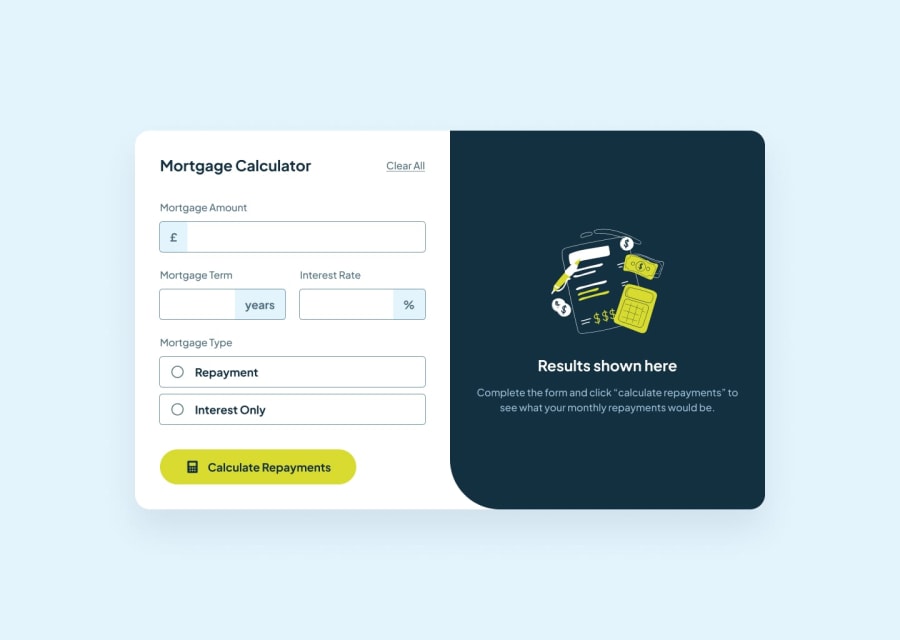
Design comparison
SolutionDesign
Solution retrospective
What are you most proud of, and what would you do differently next time?
I'm proud of how i handle all the form validation, styling of error messages and responsive design for all devices.
What specific areas of your project would you like help with?One thing which can be added was the comma while typing the number in input field, if anyone have suggestions on how to do it or feedback on the project itself, let me know.
Community feedback
Please log in to post a comment
Log in with GitHubJoin our Discord community
Join thousands of Frontend Mentor community members taking the challenges, sharing resources, helping each other, and chatting about all things front-end!
Join our Discord
