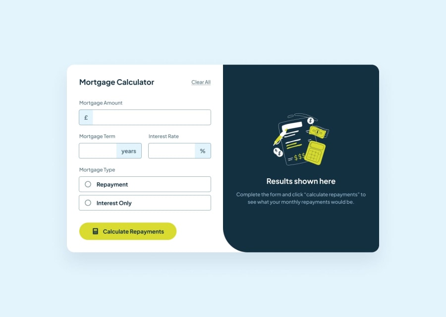
Design comparison
SolutionDesign
Solution retrospective
What are you most proud of, and what would you do differently next time?
I got the logic for the JS very fast, faster than I expected, actually, still a lot of improvement room.
What challenges did you encounter, and how did you overcome them?The text inputs for amount, term and rate, I could not figure out how to get the characters on the side to have the background and still be "combined" with the input. I stumbled with a tutorial on a similar app and saw the user do it.
Also, the fact that I had to custom make the radio buttons.
What specific areas of your project would you like help with?Overall, I feel that my use of React is still very clumsy, I'm not taking full advantage of it, I have a lot of code in one file.
Community feedback
Please log in to post a comment
Log in with GitHubJoin our Discord community
Join thousands of Frontend Mentor community members taking the challenges, sharing resources, helping each other, and chatting about all things front-end!
Join our Discord
